Fall Wood Sign: 22 Ideas That Skip the Basic Pumpkin Look

I’ll be honest, I used to think “fall wood sign” meant one thing: an orange pumpkin, some black script, maybe a leaf stencil if you were feeling fancy.
Then I started digging through what people are actually making right now, and it’s a completely different world. There’s a wood burned mandala with mirrored rabbits.
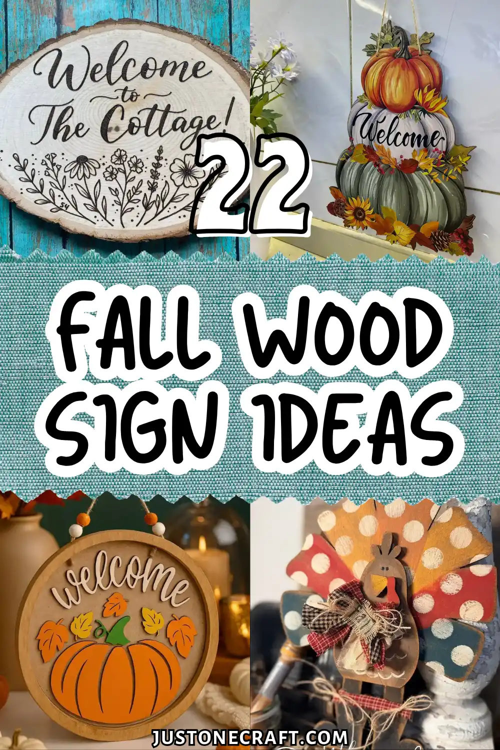
A camper trailer with a heart cut into the window. Coasters shaped like tiny mushrooms that say “thankful.”
Even the pumpkins themselves show up in navy, sage, and cream instead of the usual orange lineup.
What ties all 22 of these together isn’t a color palette or a shape, it’s that none of them look like they came off a factory line. Here’s the full roundup, with the small details that make each one worth copying.
1. A Primitive Layered Turkey That Skips the Cutesy Look Entirely
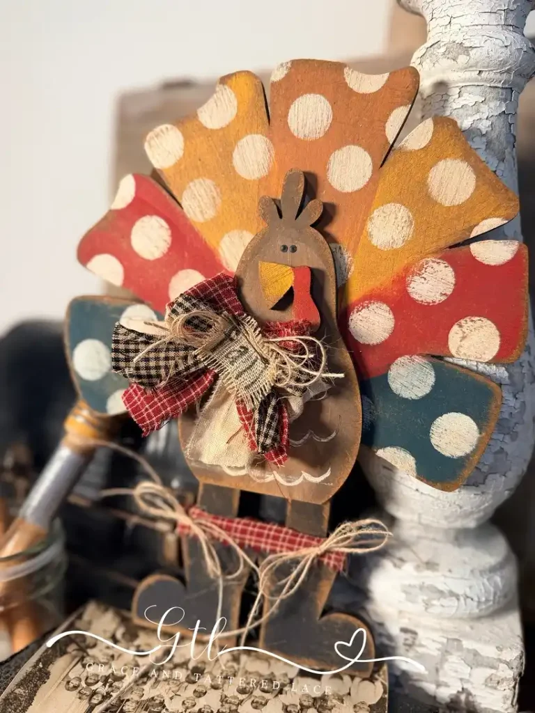
Polka dots do a lot of the work here. Instead of a smooth painted turkey, this one leans fully primitive: mustard, barn red, and slate blue tail feathers, each hand distressed so the white dots look worn in rather than printed on.
The plaid and burlap bow tied at the neck adds texture without looking fussy, and the little wood block base wrapped in ribbon keeps it freestanding on a mantel or entry table.
If your fall shelf already leans farmhouse, this style layers in nicely next to crackle finish candlesticks or aged pitchers.
The trick is keeping every piece a little uneven. Perfectly painted dots would kill the charm.
💡 Quick Tip
Dry brush your dots with a nearly empty brush so some base color peeks through. That’s what gives primitive pieces their aged look.
2. Carved Fern Detail Turns a Plain Wood Tray Into Wall Art
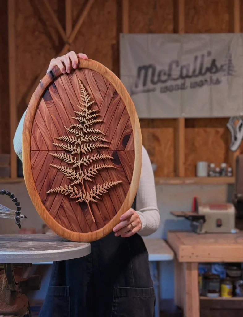
This oval piece uses chevron planked wood as the backdrop, then lets a raised fern frond do all the talking.
The contrast between the darker reddish wood and the lighter carved leaf gives it real depth, almost like the fern is growing out of the surface.
It’s a reminder that fall signs don’t need pumpkins or plaid to feel seasonal. A woodland motif carries the same warmth.
3. A Dancing Skeleton Porch Sign for the House That Goes All In on Halloween
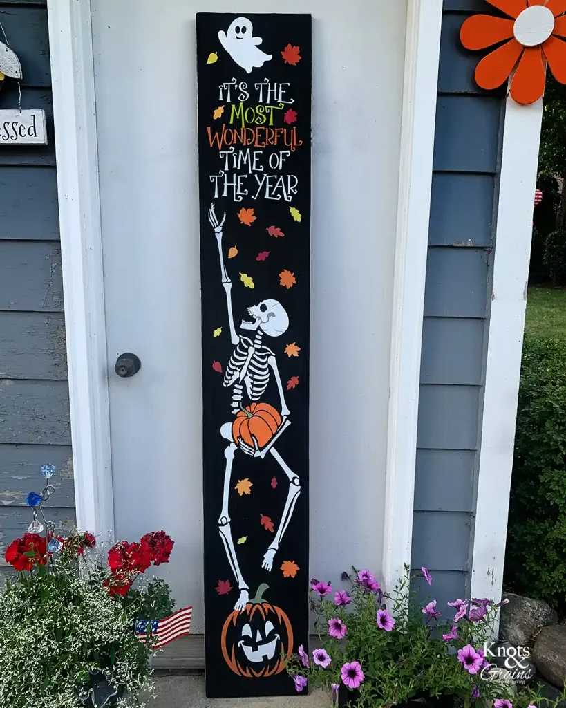
Black background, bright bouncy lettering, and a skeleton mid dance holding a pumpkin.
This one is playful rather than spooky, which makes it work for families with trick or treaters who want fun over frightening.
The scattered leaves in the background tie it to fall even though the main character is pure Halloween.
Getting this look on your own board comes down to layering the elements in order.
- Base coat the board black and let it dry fully.
- Stencil or freehand the bouncy lettering first, since it anchors the composition.
- Add the skeleton and pumpkin last so they sit on top of the leaves and text.
4. A Wood Burned Mandala Proves Fall Art Doesn’t Need a Single Pumpkin in Sight
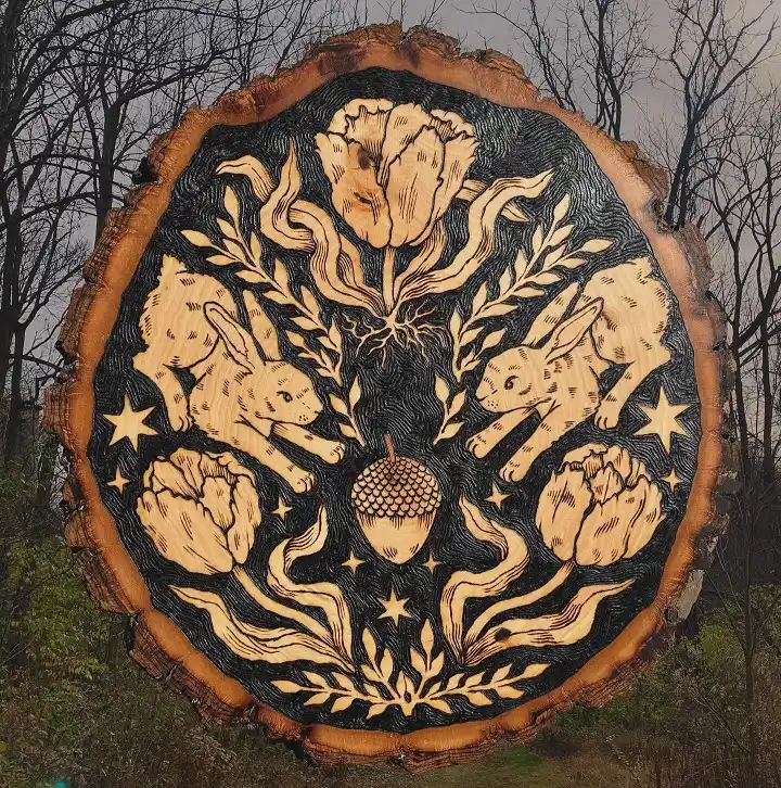
Two facing rabbits, a center acorn, tulips, and tiny stars burned into a live edge wood slice. Nothing about this says autumn on the surface, and that’s exactly the point.
It reads as woodland folklore, the kind of piece that works from September through winter without feeling dated the day pumpkin season ends.
The symmetry is what sells it. Every element mirrors its opposite, which is a lot harder to freehand than it looks.
5. Two Tone Blue and Orange Makes This Pumpkin Patch Sign Pop Without Trying Too Hard
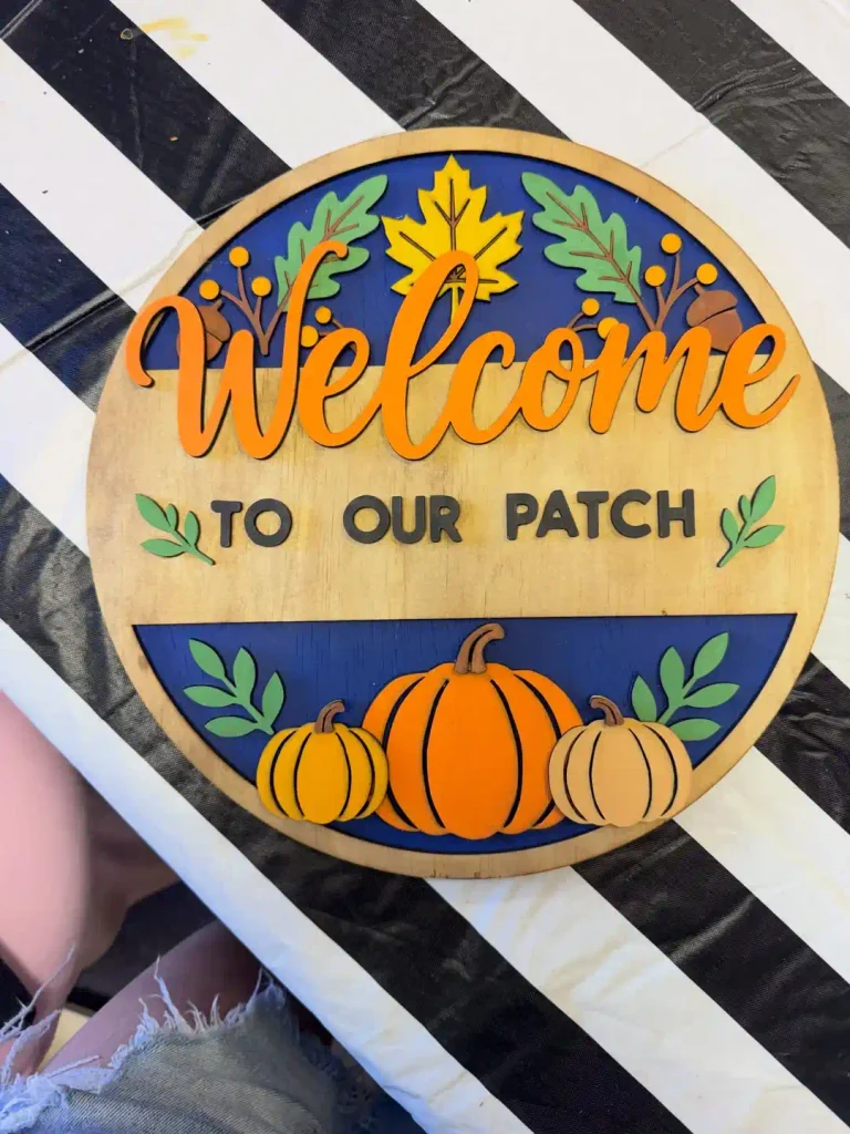
Navy blue panels behind a script “Welcome to our patch” and a trio of layered pumpkins give this round sign real contrast.
Most fall signs stick to warm tones front to back, so the cool navy backing here is what makes the orange and yellow pumpkins jump forward instead of blending in.
Recreate this look
6. Hand Painted Word Slices Bring Fall Craft Energy Even Without a Single Leaf
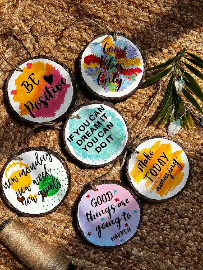
These wood slice ornaments skip fall imagery entirely and go straight for color and handwriting.
Watercolor style backgrounds in coral, teal, and gold sit under hand lettered phrases, each one different from the next.
Hung together on twine, they read less like matching decor and more like a personal collection, which is honestly more interesting on a shelf.
Vary background colors across the set.
Let paint bleed softly at the edges.
Repeating the same phrase twice.
Perfectly ruled, robotic lettering.
7. Claw Hand Hangers Make This Halloween Sign Set Feel Like a Matching Family
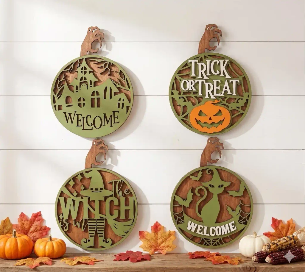
Four round signs, one hanging system. Each disc uses the same green cutout style over dark wood, but the imagery rotates between a haunted house, a jack-o-lantern, a witch’s legs, and a black cat.
What ties them together isn’t the picture, it’s the eerie carved hand at the top of every single one.
That repeated detail is what makes a group of separate signs feel like a designed set instead of four random pieces.
| Shared Element | What Rotates |
|---|---|
| Claw hand hanger on every sign | Center image (house, pumpkin, witch, cat) |
| Moss green cutout color | Wording on two of the four |
8. Decoupaged Letters Spell Out HOME With a Different Pumpkin Cluster on Each One
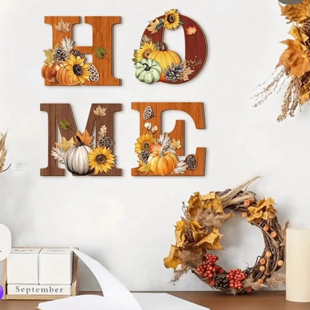
Big block letters get the fall treatment here, with printed pumpkins, sunflowers, and dried florals tucked into the corner of every letter instead of hanging as a wreath or garland. It is a smart way to fill wall space without committing to a single flat sign.
Each letter can shift slightly, some warmer, some using more greenery, so the whole word feels layered rather than uniform.
Breaking one word into four letters means four small canvases, so mismatched florals actually look intentional.
9. A Script Cutout That Uses Negative Space Instead of a Solid Pumpkin Shape
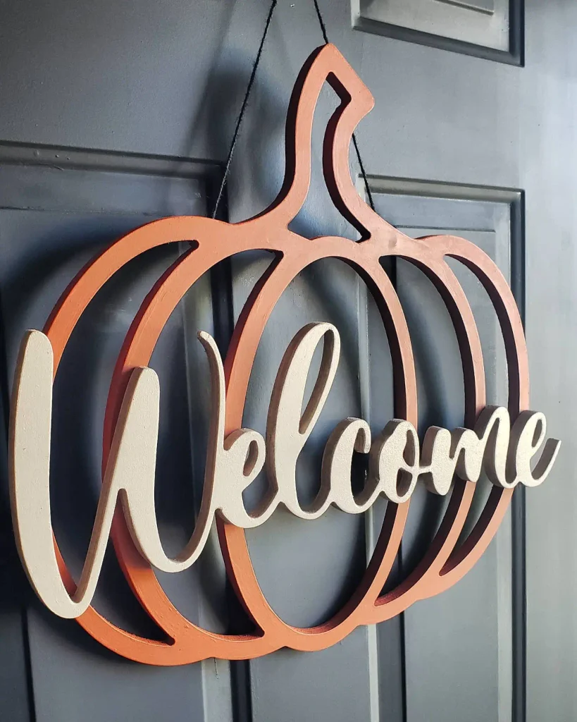
Rather than painting a pumpkin and adding text on top, this sign cuts the word “Welcome” straight through the outline, so the door color shows through the lettering itself.
The two tone finish, muted orange body with a cream script, keeps it from looking like a kids craft even though the pumpkin shape is simple.
Hung against a dark door, the negative space script really stands out from a distance, which matters more than detail work when it’s the first thing guests see.
📌 Good To Know
Cutting the script through the shape reads better on dark doors than painted lettering, since the door color becomes part of the design.
10. Stacked Pumpkins in Three Different Finishes Instead of One Repeated Color
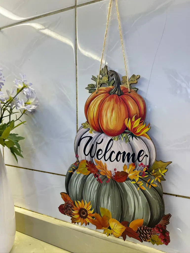
Orange, cream, and sage green pumpkins stack top to bottom on this sign, each one printed with its own texture instead of a flat color fill.
A ring of mixed fall leaves and a single sunflower wraps the base seam where the middle and bottom pumpkins meet, which keeps the transition from looking abrupt.
It is a good option for anyone who wants a Welcome sign but is tired of the standard round or rectangle shape.
Three pumpkins in the same shade, stacked flat with no contrast between them.
Orange, cream, and sage layered top to bottom, tied together with a floral seam.
11. Wood Burned Script Paired With Botanical Line Art Instead of Fall Leaves
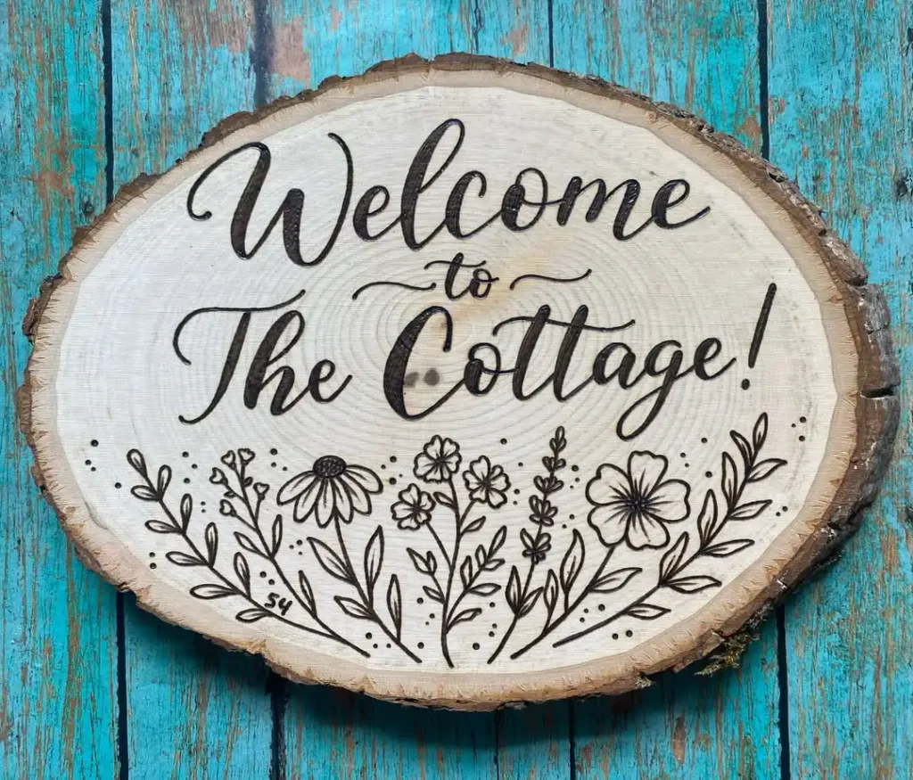
“Welcome to the Cottage” gets a wood burned treatment on a bark edge oval, but the detail worth copying is underneath the text.
Instead of maple leaves or acorns, this one uses a row of simple wildflowers, daisies, small blooms, a sprig of lavender, burned in fine line detail.
It shifts the whole piece away from harvest imagery and toward something more garden cottage, which works well for anyone decorating past October into a general autumn or year round porch look.
- Sketch the script lightly in pencil before burning, spacing matters more than speed
- Keep the floral line work thin and consistent so it reads as botanical, not doodled
- Leave generous white space around the flowers so the design doesn’t feel crowded
12. Wood Bead Coasters With a Tiny Thankful Mushroom Charm Tied On
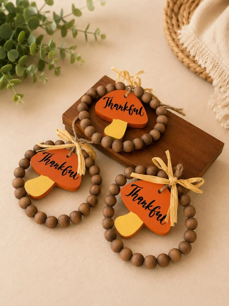
Not a sign in the traditional sense, but this is where fall wood sign ideas get fun, shrinking the concept down to a coaster.
Each wood bead ring gets a small mushroom shaped tag reading “Thankful,” attached with jute and a raffia bow.
Set as a stack of three, they double as table decor or a small hostess gift, and the mushroom shape is a nice break from the usual pumpkin or leaf charm.
13. A Word Stack Porch Sign That Reads Like a Fall Playlist
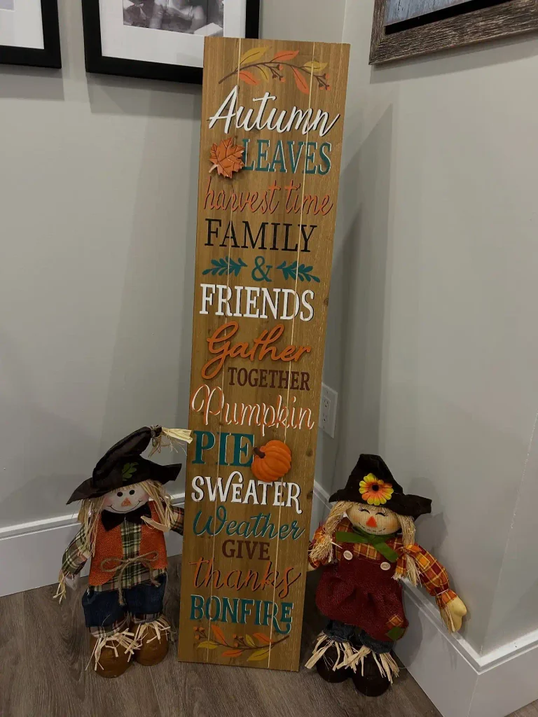
Autumn. Harvest time. Family and friends. Gather together.
This tall leaner packs a dozen fall phrases into one column, each in a different font and color so the eye keeps moving down the board instead of stalling.
Flanked by two scarecrow dolls on the floor, it becomes the anchor of an entryway vignette rather than a standalone piece.
Sketch your full word list and spacing before painting.
Alternate script and block fonts every few lines for rhythm.
Add icon accents only where a line needs a visual break.
14. A Scalloped Frame Border Is What Elevates This Simple Welcome Fall Sign
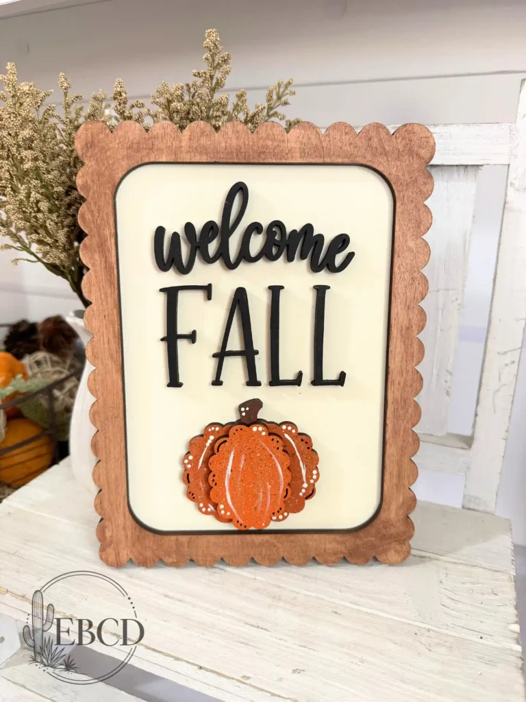
Take away the frame and this is just script text over a plain panel. Keep it, and it looks like a finished, boutique style piece.
The scalloped edge, stained a warm cognac, wraps a cream inset holding two font styles, script for “welcome” and block caps for “FALL,” with a single glitter finished 3D pumpkin anchoring the bottom.
It’s proof that the frame treatment can matter as much as the words inside it.
15. A Happy Campers Sign That Trades Pumpkins for a Heart Shaped Camper Window
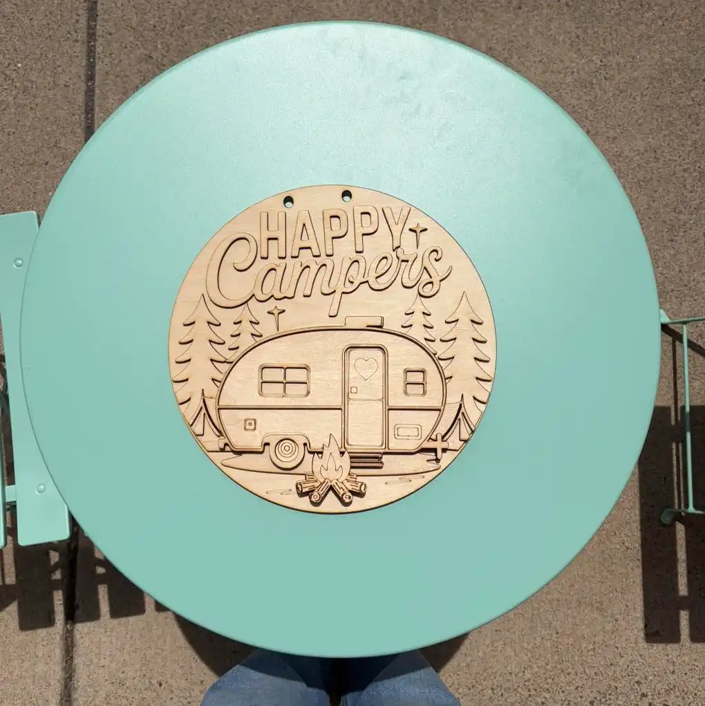
Fall doesn’t always mean harvest imagery, and this laser engraved piece is a good example of a seasonal sign built around a lifestyle instead.
A vintage camper trailer sits between two rows of pine trees with a small campfire underneath, and the tiniest detail, a heart cut into the camper door window, is what makes it feel personal instead of generic clip art.
It’s a strong pick for anyone who spends fall weekends camping rather than decorating for it.
Recreate this look
16. A Tiered Stack of Single Word Blocks Beats One Long Sentence Sign
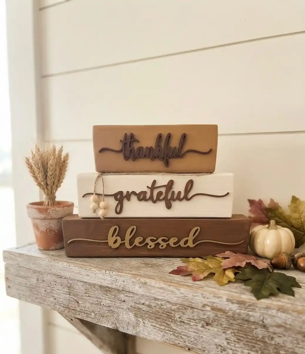
Three separate wood blocks, three separate finishes, one message when read top to bottom.
Thankful sits on a terracotta block, grateful on whitewash, blessed on a deep walnut stain, each word cut in a different laser script so the stack doesn’t feel repetitive.
A small wood bead tassel hangs off the middle block, and a stem of dried wheat in a terracotta pot leans against the base to soften the edges.
What makes this stand out from a single long sign is the flexibility. Rearrange the blocks, swap a word out for a season, or spread them across a mantel instead of stacking them tight.
Stain each block a different shade before adding words.
Vary the size slightly so the stack tapers naturally.
Using the same font for all three words.
Gluing blocks permanently, you’ll want to rearrange them.
17. Layered Wood Rings Give This Welcome Sign Actual Depth on a Shelf
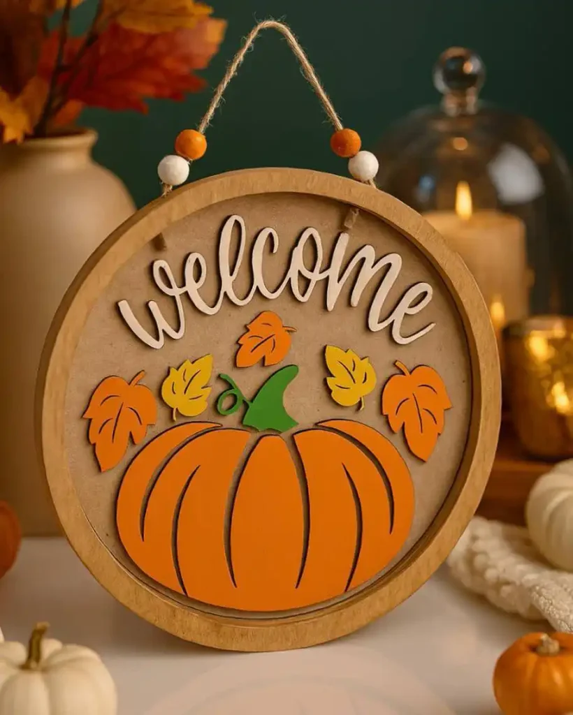
Most round welcome signs are flat front to back. This one isn’t. A raised outer ring in warm honey stain frames an inset panel where the pumpkin and leaves sit slightly recessed, so shadows fall naturally across the piece even under simple room lighting.
The bead garland hanger, orange and white wood beads on jute, repeats the color story instead of being an afterthought.
| Flat Sign | Layered Ring Sign |
|---|---|
| Everything sits on one plane | Outer ring raised, panel recessed for shadow |
| Hanger often plain string | Bead garland hanger continues the color palette |
18. Knit Texture Cut Straight Into the Wood Instead of Painted On
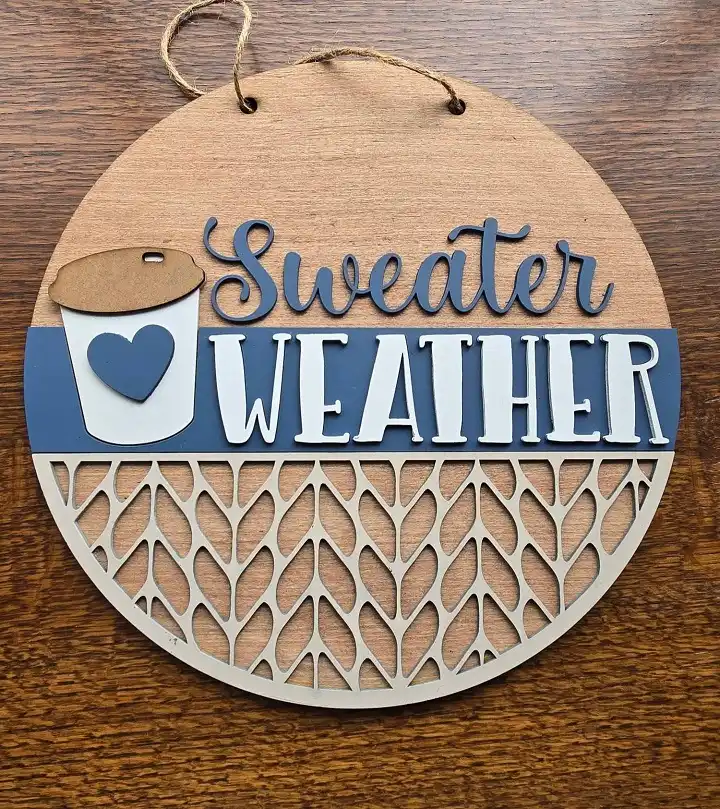
Sweater weather calls for something that actually looks knit, and this sign delivers by laser cutting a chevron knit pattern through the bottom half of the panel rather than painting stitches on top. Light and shadow do the texture work instead of a brush.
Up top, a to go cup with a painted heart and the phrase “Sweater Weather” in navy and cream keeps the palette cool instead of the usual orange heavy fall lineup.
A cut through pattern reads as texture in a way flat paint never can, and it costs nothing extra once the design file is set.
19. Mini Paddle Ornaments Turn Fall Quotes Into a Set Instead of a Single Sign
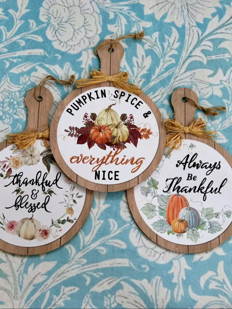
Three small paddle shaped signs, each with a printed watercolor pumpkin scene and its own short phrase.
Thankful and blessed pairs with blush roses, pumpkin spice and everything nice sits with a trio of white pumpkins, and always be thankful gets its own pumpkin cluster in cooler sage tones.
Raffia bows tie each one off, and grouped together they read like a little collection rather than three separate purchases.
💡 Quick Tip
Keep the raffia bow color consistent across all three paddles even if the artwork varies, it’s what visually ties the set together.
20. Three Chunky Standalone Pumpkins Where the Finish Does All the Talking
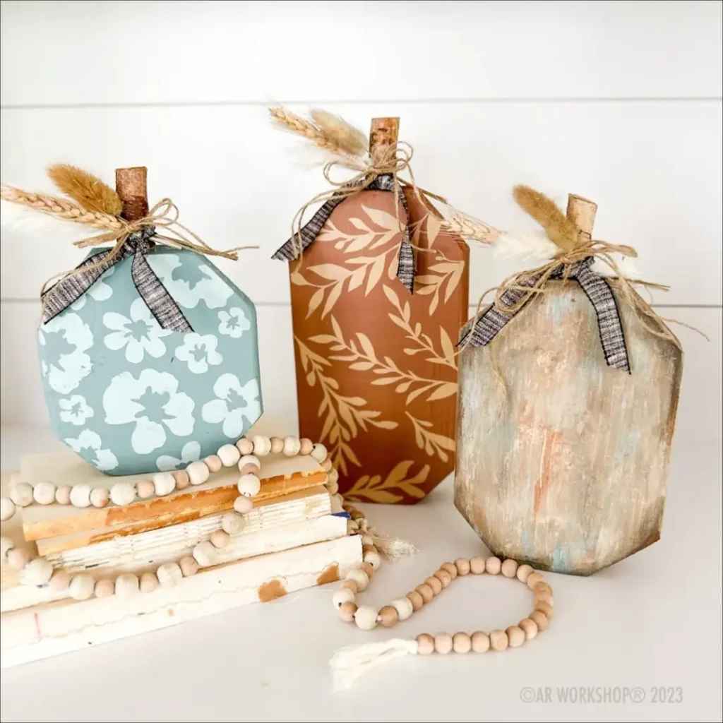
No lettering, no phrases, just three thick octagon topped wood pumpkins finished three completely different ways.
One gets a soft blue floral stencil, one a rust base with leaf branch pattern, and the last a weathered whitewash that looks pulled from an old barn.
Real wheat stems poke out of the stem hole on each one, tied off with the same charcoal ribbon so the trio still reads as a set despite the finish differences.
A raw wood pumpkin blank with no color or texture.
Three finishes, one stencil, one weathered wash, one leaf pattern, grouped as a set.
21. Graduated Height Porch Leaners Turn One Design Into a Full Display
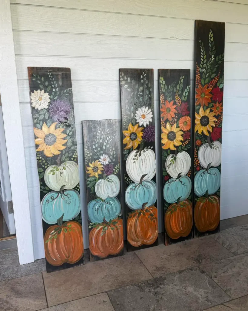
Same painted pattern, five different heights. Each board carries the same stacked pumpkin base in orange, seafoam, and white, topped with hand painted sunflowers and dahlias against a black background, but the florals shift slightly taller as the boards grow.
Lined up against a porch wall or doorway, the staggered heights create a skyline effect that a single matching sign could never pull off.
- Paint all boards with the same base palette before adding florals, so the set reads as one family
- Let the floral height grow with the board, don’t just repeat the same top on every size
- Stagger the boards unevenly when displaying rather than lining them up perfectly flat
22. A Retro Storybook Jack-O-Lantern Instead of a Modern Cartoon Pumpkin
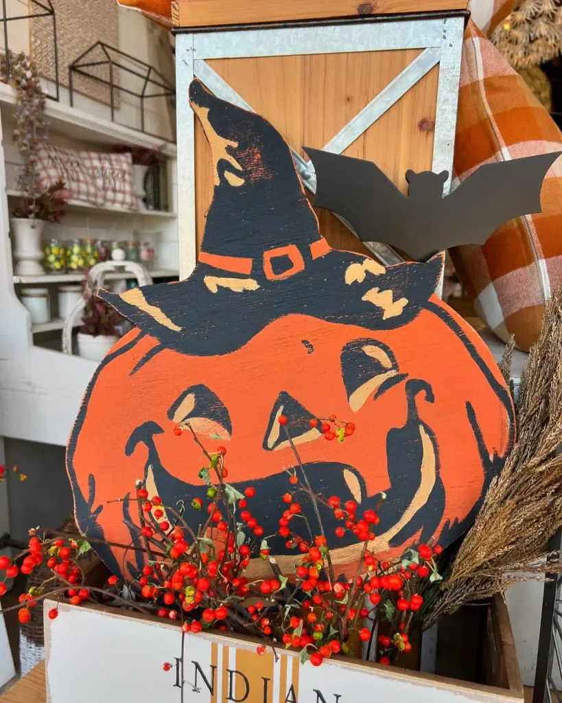
Black, orange, and mustard, painted with the loose, slightly uneven linework of a vintage Halloween postcard.
This grinning pumpkin wears a witch’s hat with a painted buckle band, and a black wood bat is tucked in beside it like it just landed there.
Surrounded by real bittersweet berries and dried wheat instead of plastic stems, it looks pulled from a farmhouse porch display rather than a big box store shelf.
Style: vintage storybook Best for: front porch or entry table Effort: one afternoon